
How to Choose Grout Color for Tile
Learn how to choose grout color for tile with expert tips on matching, contrasting, testing samples, and sealing for a flawless, low-maintenance finish.
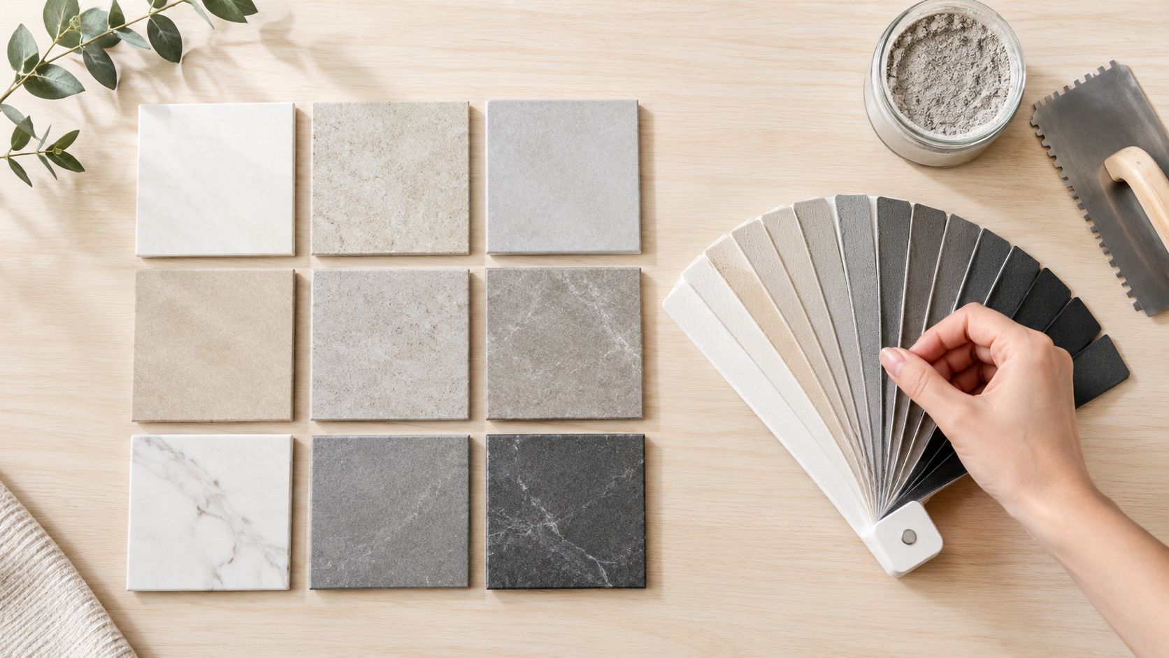
You're standing in a Massachusetts tile showroom with a tile sample in one hand and a wall of grout swatches in the other. The white looks clean, the gray feels safer, and the dark charcoal makes the pattern pop. Then you picture that same choice under bathroom sconces, beside your kitchen cabinets, and after months of muddy shoes, soap residue, and hard-water deposits.
Grout color isn't a minor finishing detail. It changes how large a room feels, how clearly a pattern reads, and how much everyday soil you'll notice between cleanings. The right choice starts with the visual effect you want, then accounts for the tile material, room lighting, traffic, moisture, and the quality of installation.
Table of Contents
The Core Rule of Matching Versus Contrasting
A homeowner once brought two grout samples to a tile consultation. The first was close to the warm white of a subway tile. The second was a deep gray that outlined every rectangular piece. Both looked attractive on the sample board, but they created completely different rooms. The matching shade made the backsplash feel calm and continuous. The darker option turned the running-bond layout into the main graphic feature.
That distinction is the foundation of how to choose grout color for tile. A grout color close to the tile reduces visual interruption, so the surface reads as a unified field. This approach can help a compact bathroom or narrow backsplash feel more open because the eye isn't stopping at strongly defined joints.
A contrasting grout does the opposite. It makes each joint visible and emphasizes the tile's shape, spacing, and layout. Herringbone, hexagon, picket, and geometric patterns become more prominent when the grout deliberately separates each piece.
Decide what should attract attention
Ask one question before comparing shades: Should people notice the tile surface, or the pattern created by the joints?
Choose a close match when you want:
- A quieter surface: The tile texture, color variation, or cabinetry can remain the focus.
- A more continuous appearance: Similar values soften the grid and reduce visual breaks.
- A restrained small-room design: Matching grout generally avoids making a compact wall feel busy.
Choose contrast when you want:
- A defined layout: Darker grout can make a herringbone backsplash or hexagon floor unmistakable.
- Graphic character: Strong joints add rhythm and structure to plain tile.
- Visible geometry: The installation itself becomes part of the room's decoration.
The history of grout helps explain why both approaches are now familiar. Grout originally protected tile edges rather than serving as a decorative choice, and it wasn't treated as a niche design feature until the mid-1980s, according to Floor Covering Weekly's review of grout history. Early grout was commonly made from sand and cement in gray or white, and early cement grouts could have absorption over 35%, making staining a practical concern.
Practical rule: Match grout when you want the tile to read as one surface. Contrast it only when you're comfortable making every joint part of the design.
Don't choose contrast just because a showroom display looks dramatic. A high-contrast grid can expose uneven tile edges, inconsistent joint widths, or slight alignment problems that a closer shade would soften. In a professionally laid installation with a deliberate pattern, contrast can be excellent. On an irregular surface, it can magnify flaws.
Evaluating Tile Material and Surface Patterns
A grout shade that works beautifully with a uniform porcelain tile may fight with marble veining, overwhelm a mosaic, or alter the appearance of transparent glass. Start with the tile itself, not the grout display.
Follow a material-first workflow
1. Identify the tile's visual structure. Is it solid, patterned, veined, multicolored, glossy, textured, glass, or natural stone? A single-color tile gives you a straightforward field to match. A complex tile needs a more selective approach.
2. Find the dominant color. For patterned or multicolor tile, look at the shade that occupies the most visual area. Matching that dominant color usually creates the least interruption. A mid-tone neutral can be more flexible when several colors compete for attention.
3. Check the tile's value. Value means how light or dark the surface appears, separate from whether it looks blue, beige, green, or gray. Grout close in value tends to blend more effectively than a shade with a stark light-dark difference.
4. Consider opacity. Opaque porcelain and ceramic give you a predictable surface. Transparent or translucent glass can interact with the grout beneath it, so the joint may become part of the tile's visible color. Manufacturer guidance in the Custom Building Products grout color selector specifically points to dominant color, pattern, and transparency as starting factors.
5. Account for veining and variation. With marble or marble-look tile, match the background field when you want continuity, or use a restrained neutral that supports the veining. Matching a grout shade to a dramatic vein can create an unintended striped effect.
For homeowners comparing porcelain and ceramic, the porcelain versus ceramic tile guide can help clarify the tile material before you make a grout decision. The grout selection still depends on the installed surface, joint size, finish, and room conditions.

Use the pattern as a design signal
For a plain white subway tile, a soft gray can provide definition without the sharp outline of black. For a patterned encaustic-style tile, a neutral close to the background often prevents the joints from competing with the pattern. For a mosaic, consider the overall impression from standing distance rather than matching one tiny tessera.
Glass tile deserves extra care. A pale grout can keep a translucent installation bright, while a darker grout can add depth but may visibly change the color of the glass. Test before ordering material, especially when the backsplash or shower wall receives both daylight and artificial light.
Natural stone also benefits from restraint. A heavily veined marble already contains movement, so a strongly contrasting grout can create competing lines. In many cases, a mid-tone neutral or a shade close to the stone's base color gives the surface room to speak for itself.
Balancing Aesthetics With Daily Maintenance
Bright white grout can look crisp on installation day, especially against light ceramic, porcelain, or marble-look tile. In a busy Massachusetts kitchen entry, however, it may show tracked-in soil quickly. In a shower, soap residue and mineral deposits can become visible sooner on a very light joint than on a medium neutral.
Medium-to-dark neutrals, including gray, greige, and charcoal, generally make everyday grime less obvious. That doesn't mean dark grout stays clean without care. It means normal variation is less visually exposed between cleaning sessions, which matters in family bathrooms, mudrooms, kitchen floors, and heavily used entries.
Compare the daily trade-offs
| Grout Color Family | Best Application | Maintenance Visibility | Cleaning Frequency |
|---|---|---|---|
| Bright white | Low-traffic walls, bright cohesive designs, feature backsplashes | Shows dirt, soap residue, and mineral deposits readily | Frequent spot cleaning and regular deeper cleaning |
| Soft white to light beige | Warm, blended walls and lightly used surfaces | More forgiving than bright white, but still shows buildup | Routine cleaning with attention to wet areas |
| Gray or greige | Kitchens, bathrooms, floors, and active household spaces | Moderate visibility, with everyday soil less prominent | Consistent routine cleaning, plus periodic deep cleaning |
| Charcoal or very dark neutral | Pattern emphasis, selected floors, dramatic backsplashes | Hides some soil but can show pale mineral residue and uneven fading | Routine cleaning and careful inspection for deposits |
The main mistake is choosing a very light grout for a high-moisture or high-traffic location solely because the sample looked fresh. The tile grout maintenance guidance from CavaStone identifies lighter grout as more likely to reveal dirt, soap residue, and mineral deposits, while medium-to-dark neutrals can be more forgiving in demanding spaces.
Contrast creates another trade-off. A dark joint around light tile can make alignment variations more obvious, particularly if the tile edges aren't perfectly uniform. If the layout is intentionally graphic and the installation is precise, that effect may be desirable. If the surface has handmade variation or a less exact layout, a closer grout shade usually produces a more forgiving result.
For practical cleaning methods, use a routine suited to the grout and sealer rather than relying on aggressive chemicals. Sunny Day Pro Services' guide to cleaning tile grout is a useful reference for homeowners planning ongoing care.
A grout color should look good on the day you finish cleaning, not only on the day the tile is installed.
Testing Physical Samples in Actual Room Lighting
Printed grout chips and phone screens are useful for narrowing choices, but they aren't reliable enough for a final decision. Paper has a different surface and reflectivity from cured grout. A screen also changes the color you see through brightness, display settings, and surrounding colors.
Lighting creates another variable. Daylight can make a grout appear cooler, brighter, or more neutral, while warm bulbs can pull some shades toward beige or yellow. Cool artificial lighting may emphasize blue or green undertones. The same sample can look acceptable in a showroom and wrong beside your own cabinets or countertop.
Test the way the installation will be seen
Use spare tile from the actual project whenever possible. Mix a small amount of each grout candidate according to the manufacturer's directions, then apply each shade in a separate patch with the same joint width and tile surface you'll use in the room.
Follow this sequence:
- Label every patch. Record the grout name and color so you won't rely on memory later.
- Use the actual tile. A printed photo or substitute tile won't show the same glaze, texture, or absorption.
- Place the samples vertically or horizontally as appropriate. Wall grout should be judged on a wall, and floor grout should be viewed at floor level.
- Let the grout cure fully. Wet grout often looks different from the finished color, and curing conditions can affect the final appearance.
- Check several lighting conditions. View the patches in daylight, under the room's installed or planned fixtures, and in the evening.
- Review them from normal standing distance. A shade that looks perfect close up may create too much contrast across the full wall.
The Lowe's guide to choosing grout and mortar also recommends physical testing because natural and artificial light can shift the perceived result, and cured grout may differ from wet material or brochure chips.
Compare value separately from hue
A useful refinement is to photograph the tile and grout patches, then desaturate the image. Removing color helps you compare lightness and darkness without getting distracted by whether a grout looks warm, cool, blue-gray, or beige.
If the desaturated image shows a sharp difference, the joint will likely read as a strong outline. If the tile and grout remain close in value, the surface should appear more blended, even if their undertones differ slightly.
Don't skip the room's surrounding finishes. White cabinets, cream paint, black fixtures, wood flooring, and stone countertops can all influence how the grout appears. A physical patch beside those materials gives you information a showroom board can't provide.
Protecting the Choice With Sealing and Colorants
A grout color can look right on day one and become difficult to maintain after months of muddy shoes, cooking residue, shower use, and routine cleaning. The finished result depends on choosing a suitable grout, preparing it correctly, and protecting the joints without treating sealer as a cure for installation defects.
Grout type comes before color. Joint width, tile edges, and tile surface sensitivity determine whether sanded or unsanded grout is appropriate. The installer should follow the grout manufacturer's specifications. A carefully selected shade cannot compensate for a product that does not suit the installation.
Treat color protection as part of the plan
Color sealing and grout colorant can refresh a faded appearance, even out stained joints, and help resist future discoloration, stains, moisture, bacteria, mold, and mildew. They are useful when existing grout remains sound but has developed uneven staining.
The treatment still requires realistic maintenance. Grout must be cleaned with methods suitable for the tile and product, and the installer needs to remove residue, grease, soap film, and loose material before applying colorant or sealer. Poor preparation can weaken adhesion and leave the color inconsistent. For a practical overview of professional options, see Sunny Day Pro Services' guide to grout cleaning and sealing.
The grout color sealing information from Grout Works describes color sealing as a way to create a more uniform appearance while resisting common sources of discoloration. Consider it after checking the grout's condition. It does not correct loose joints, cracks, or water-related installation problems.
Recoloring can prevent unnecessary demolition
A disliked grout shade does not automatically require tile removal. Grout stain or colorant can change installed grout when the joints are structurally sound and properly prepared.
The manufacturer's instructions for Lowe's grout stain and colorant explain that stained grout may be returned to its original color or changed to another shade when routine maintenance no longer produces an acceptable result. Evaluate the existing grout carefully first. Colorant will not repair movement, failed joints, moisture intrusion, or incorrect tile installation.
A professional can assess whether recoloring is practical across the full surface. Complete a small test area before committing. Existing texture, porosity, and residue from earlier cleaning products can all change how the colorant absorbs and how uniform the final result appears.
Finalizing Installation and Long-Term Care
A thoughtful color can still look poor if the joints vary, the grout sits low, or residue remains on the tile surface. Installation quality controls how evenly the chosen color appears. Strong contrast makes those details easier to see, so the more graphic the grout choice, the more important consistent joint preparation and cleanup become.
Confirm the installation before the crew leaves
Ask the installer to review:
- Joint consistency: The grout lines should follow the planned width and layout without avoidable waves or abrupt changes.
- Surface cleanup: Haze and residue should be removed with methods compatible with the tile and grout.
- Curing requirements: Keep traffic, water, and cleaning products away for the period specified by the manufacturer.
- Sealer compatibility: Confirm whether the selected grout requires sealing and which product is suitable for the tile and grout combination.
- Final color review: Inspect the cured installation in both daylight and the room's artificial lighting.
Don't judge the result while the grout is still wet. Wait until the material has cured according to its product instructions, then examine the whole installation from the doorway, countertop height, shower entrance, or normal walking path.
Build a routine your household will actually follow
A manageable care plan is better than occasional harsh cleaning. Remove loose grit from floors before it gets worked into the joints, wipe shower walls after use when practical, and clean kitchen splashes before oils and food residue dry onto the grout.
Use a gentle, tile-compatible cleaner and a soft brush or non-abrasive pad. Avoid assuming that stronger chemicals produce a better result. Some products can damage finishes, weaken protection, or leave residue that attracts more soil. If a joint begins to darken unevenly, address the cause rather than repeatedly scrubbing harder.
Massachusetts homes also see seasonal traffic changes. Wet boots, salt, sand, and entryway debris can make a light floor grout show wear quickly, while a bathroom may develop mineral deposits even when the room is cleaned regularly. Choose the grout color with those conditions in mind, then arrange professional cleaning or resealing when routine care no longer restores an even appearance.
For homeowners in Wayland, Newton, Needham, Wellesley, Weston, and nearby communities, Sunny Day Pro Services offers tile installation for porcelain, ceramic, marble, and granite, along with backsplashes, bathroom remodeling, and cleaning services. Request a quote that includes the tile, grout color, sample-testing process, installation details, and long-term care plan so the finished surface works both visually and practically.
If you're planning a kitchen backsplash, bathroom floor, shower surround, or full-room remodel, Sunny Day Pro Services can help you compare grout choices, install the tile, and maintain the finished surface. Contact the team to request a fast quote and discuss a durable color and care plan for your Massachusetts home.

